Bump Chart
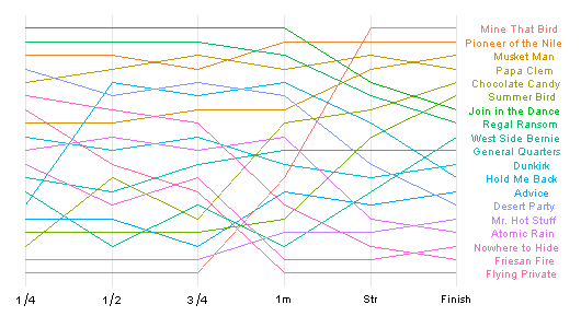
Kentucky Derby 2009 bump chart, from Charts and Graphs:

Created with ggplot2 for R. More from Learning R on its construction.
Mine That Bird’s rail dash looks no less improbable graphed, while Pioneerof the Nile’s even run looks better. Too bad there’s no Trakus data, which would make for a busier, but surely richer and more revealing, chart.
Copyright © 2000-2023 by Jessica Chapel. All rights reserved.