New Look for DRF
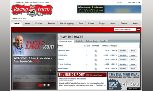
Back in May, I posted screenshots of an in-progress DRF.com redesign. Just in time for the summer meets, the new look is now live on the site*:

A few quick impressions:
Of positive note is the play-the-races module, a dashboard for the day’s racing action, which will be customizable at some point in the future, writes Steven Crist, although I do miss seeing headlines in that space above the fold. Depth of reporting is one of DRF’s strengths and I hate to see it downplayed on the homepage. The “News Center,” however, is so well laid out it makes a fine alterna-home for visitors more interested in headlines. But no RSS still? With the site built in Drupal, that’s a little surprising.
The flyout menus on the main navigation bar are nicely done, neatly handling the problem of having so much information to display.
The “Learn” and “How To” tabs of the earlier draft have been combined into one, “Learn,” which displays links to an uneven mix of educational and customer acquisition content. I do like that the Keeneland DRF archive gets some good space on the “Horse Racing History” page.
It’s not unusual to take a redesign live with a list of things to tweak, but there are aspects of the new look that are less polished than might be expected, such as the awkward spacing and empty areas of the header, footer, and certain in-page elements, and the spots of funky typography, particularly on the homepage. Maybe those items will be addressed in progressive iterations.
*1:00 PM Update: Rather, it was live, for about an hour this morning. The old look has returned. So, was the launch buggy? Or premature? [Buggy, I hear.]
2 Comments