Web Design
… for the Racing Post website. This morning, on noticing that Man of God, eighth to stablemate Frankel in his winning August 13 debut at Newmarket, had won at Yarmouth yesterday, I clicked over to that one’s Racing Post profile, with one question: Had any other horse in that race come back to win? There, I clicked on the race date, then on each finisher’s name, getting a pop-up window with each of their complete career records, and in five minutes — without logging in, entering credit card information, or downloading any PDFs — I had the answer. It was a breeze, as it is every time I visit. The site is data-rich and user-friendly. More advanced features require registration and/or payment, but elementary research can be accomplished with ease.
“We’ve embraced the internet as openly as any sport that I’m aware of,” said NTRA president Alex Waldop in a recent TDN interview. “When it comes to the horse stuff, I think we’ve done a good job,” Equibase president Hank Zeitlin told the Paulick Report. Never mind the DRF, which has invested considerable resources in developing Formulator, a powerful handicapping tool hobbled by an outmoded card-based navigation and subscription model, while letting products such as Simulcast Daily stagnate. All it takes is a few minutes with the Racing Post to realize how far the American racing industry has to go to bring American racing fans an online tool as simple and useful.
Back in May, I posted screenshots of an in-progress DRF.com redesign. Just in time for the summer meets, the new look is now live on the site*:
A few quick impressions:
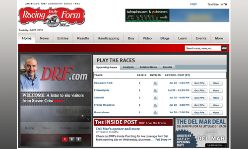
Of positive note is the play-the-races module, a dashboard for the day’s racing action, which will be customizable at some point in the future, writes Steven Crist, although I do miss seeing headlines in that space above the fold. Depth of reporting is one of DRF’s strengths and I hate to see it downplayed on the homepage. The “News Center,” however, is so well laid out it makes a fine alterna-home for visitors more interested in headlines. But no RSS still? With the site built in Drupal, that’s a little surprising.
The flyout menus on the main navigation bar are nicely done, neatly handling the problem of having so much information to display.
The “Learn” and “How To” tabs of the earlier draft have been combined into one, “Learn,” which displays links to an uneven mix of educational and customer acquisition content. I do like that the Keeneland DRF archive gets some good space on the “Horse Racing History” page.
It’s not unusual to take a redesign live with a list of things to tweak, but there are aspects of the new look that are less polished than might be expected, such as the awkward spacing and empty areas of the header, footer, and certain in-page elements, and the spots of funky typography, particularly on the homepage. Maybe those items will be addressed in progressive iterations.
*1:00 PM Update: Rather, it was live, for about an hour this morning. The old look has returned. So, was the launch buggy? Or premature? [Buggy, I hear.]
About
Jessica Chapel writes and edits in Massachusetts. Railbird is a Thoroughbred horse racing blog published from June 2004 to July 2019. More / Contact
Elsewhere
Find Jessica on Pinboard and Instagram, Railbird on LibraryThing and Twitter.
Etc.
Links
Search
Boston Racing
Spreadsheets/Data
Copyright © 2000-2023 by Jessica Chapel. All rights reserved.