Redesign
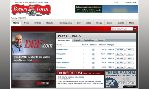
Back in May, I posted screenshots of an in-progress DRF.com redesign. Just in time for the summer meets, the new look is now live on the site*:

A few quick impressions:
Of positive note is the play-the-races module, a dashboard for the day’s racing action, which will be customizable at some point in the future, writes Steven Crist, although I do miss seeing headlines in that space above the fold. Depth of reporting is one of DRF’s strengths and I hate to see it downplayed on the homepage. The “News Center,” however, is so well laid out it makes a fine alterna-home for visitors more interested in headlines. But no RSS still? With the site built in Drupal, that’s a little surprising.
The flyout menus on the main navigation bar are nicely done, neatly handling the problem of having so much information to display.
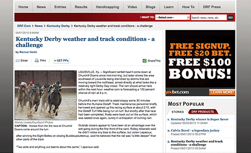
The “Learn” and “How To” tabs of the earlier draft have been combined into one, “Learn,” which displays links to an uneven mix of educational and customer acquisition content. I do like that the Keeneland DRF archive gets some good space on the “Horse Racing History” page.
It’s not unusual to take a redesign live with a list of things to tweak, but there are aspects of the new look that are less polished than might be expected, such as the awkward spacing and empty areas of the header, footer, and certain in-page elements, and the spots of funky typography, particularly on the homepage. Maybe those items will be addressed in progressive iterations.
*1:00 PM Update: Rather, it was live, for about an hour this morning. The old look has returned. So, was the launch buggy? Or premature? [Buggy, I hear.]
In the wake of developments at Blood-Horse and Newsweek, Ray Paulick is pondering the future of print. Replying to an observation I made here, he asks:
But can a robust digital strategy financially carry a flagging print product?
Let’s leave aside for now the implicit assumption in the question of print’s primacy, and reframe it: What digital strategy can carry a print product?
For clues, look to the venerable Atlantic:
This year, with print revenues holding steady in the down market, digital and event revenues are expected to make up nearly half of the [Atlantic’s] total haul. For the month of April, according to Mr. Smith, The Atlantic brought in more revenue from digital advertising than it did from print.
Or to Newsweek editor Jon Meacham, reportedly working on a bid to buy the magazine, who told Jon Stewart on the Daily Show that “it’s probably time to flip” the focus of production from print to digital.
Derek Powazek offers five easy steps on how a magazine might make that flip. Of course, there’s nothing easy about altering the brutal economics of weekly publishing, but Powazek’s advice includes a couple recommendations that seem particularly pertinent to racing magazines, such as connecting to your community, looking to tiered subscribers for revenue (which means developing digital products they’ll pay for), and using print to package the best from the previous week (or month). The last point is crucial: A weekly print magazine isn’t delivering the news, it’s archiving it — make each issue worth keeping.
Is a DRF.com redesign in the works? Earlier this afternoon, a correspondent emailed a URL — accidentally discovered through a Google search and completely unprotected — that appears to be a Daily Racing Form development site. The new look, obviously in progress and still a little rough, has a smart and modern feel and makes racing information more visible on the main page (very Racing Post of them). It’s also built on Drupal, an open source CMS that attracted good buzz this week when the Nation announced it was the system underlying their freshened site.
Screenshots (homepage, interior page, navigation detail):


The DRF site was last updated in January 2007 (a project I was very much involved with as site manager); the redesign then was geared towards its existing audience. What’s interesting about the direction DRF seems to be going in with this look is that, in addition to making the site more functional for users who are already horseplayers and DRF customers, there appears to be an emphasis on making the site (and game, presumably, based on the recent introduction of a product like EasyForm) more accessible to new players and casual fans. Note the tabs “Learn” and “How To” in the navigation bar — fan education is more prominent than it is on the current site.
Copyright © 2000-2023 by Jessica Chapel. All rights reserved.