DRF
John Pricci on the DRF bloc voting Blame as Horse of the Year:
The shocking portion, however, was Daily Racing Form’s tally, a margin that looked very much like a third judge at a heavyweight title fight who was looking the other way while a battle was joined.
Joe Drape on the same subject:
Not surprising, but how un-expert. (via @raypaulick) DRF block went for Blame 38-21. How can DRF say it’s the authority on horse racing?
The argument could be made that the DRF bloc made the least shocking, most expert pick, going for a male winner of multiple Grade 1s over main track dirt with a narrow edge in speed figures (five triple digits to Zenyatta’s four) — a horse who beat the other the one time they met in the race that everyone said would decide the title (before the race was even run). They voted the dogma, which, most years, nicely aligns with what happens on track. That it didn’t this year says much more about how ultimately unsatisfying both leading HOTY contenders’ 2010 campaigns were than it does about DRF voters’ judgment.
Based on the rancorous debates of the past couple years surrounding the HOTY title, Todd Lieber argues in the Thoroughbred Times that Eclipse voters should have set criteria to guide their votes:
It would be up to others with far more knowledge and greater standing in the industry than this correspondent to determine what those criteria should be, but since I’ve raised the issue I will at least hazard a suggestion. The honor should go to the horse with the most consistent record of achievement at the highest level of racing during the year. To be sure, this will not stifle debate, but it would at least focus the questions.
Well, that’s awfully vague. How about a points system for HOTY?
What to look for when Santa Anita opens with its new dirt surface:
… welcome back front-runners to a surface that track project manager Ted Malloy expects will reward fast horses.
“A fast track, if it’s not tiring, is always speed-favoring,” Malloy said.
“I must have worked 20-something horses that first week and 20-something the second, and the track was fast,†she said. “Like holy guacamole fast.”
And:
“This track is going to be very good. It will probably be a little speed biased. I think dirt handicappers are going to love it.”
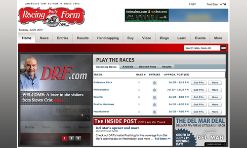
Back in May, I posted screenshots of an in-progress DRF.com redesign. Just in time for the summer meets, the new look is now live on the site*:

A few quick impressions:
Of positive note is the play-the-races module, a dashboard for the day’s racing action, which will be customizable at some point in the future, writes Steven Crist, although I do miss seeing headlines in that space above the fold. Depth of reporting is one of DRF’s strengths and I hate to see it downplayed on the homepage. The “News Center,” however, is so well laid out it makes a fine alterna-home for visitors more interested in headlines. But no RSS still? With the site built in Drupal, that’s a little surprising.
The flyout menus on the main navigation bar are nicely done, neatly handling the problem of having so much information to display.
The “Learn” and “How To” tabs of the earlier draft have been combined into one, “Learn,” which displays links to an uneven mix of educational and customer acquisition content. I do like that the Keeneland DRF archive gets some good space on the “Horse Racing History” page.
It’s not unusual to take a redesign live with a list of things to tweak, but there are aspects of the new look that are less polished than might be expected, such as the awkward spacing and empty areas of the header, footer, and certain in-page elements, and the spots of funky typography, particularly on the homepage. Maybe those items will be addressed in progressive iterations.
*1:00 PM Update: Rather, it was live, for about an hour this morning. The old look has returned. So, was the launch buggy? Or premature? [Buggy, I hear.]
Copyright © 2000-2023 by Jessica Chapel. All rights reserved.